Choosing a color scheme is an important part of home decorating. You want to avoid schemes that contain many bright colors, because they are unpleasant and confusing. At the same time, you’ll also want to steer clear of boring palettes that contain only dull colors.
Color can make or break a decorating project. Make sure you do some research before painting. Knowing some basic information about colors will help you pick a flattering color scheme.
The Color Wheel
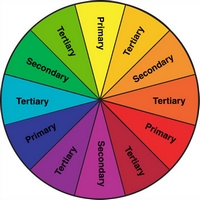
The color wheel is a valuable tool for developing color schemes. It is exactly what it sounds like: a round disk printed with many colors.
Primary Colors
The primary colors are red, yellow, and blue. Every hue on the color wheel is composed of one or more of these colors.

Secondary Colors
Secondary colors are created by mixing two of the primary colors. Red and yellow make orange. Yellow and blue make green. Blue and red make purple.
Tertiary Colors
Tertiary colors are created by mixing a secondary color with a neighboring primary color. Examples would be combining purple with blue to get a bluish purple, or combing green with yellow to create chartreuse.
Types of Paint Color Schemes
There are several types of color schemes, and each can enhance your home. Keep your color wheel handy, and test a few out. You’ll be a color expert in no time.
Monochromatic Paint Color Scheme
An almost fail-proof decorating method is to use a monochromatic color scheme. Literally one-color. Basically, you choose a hue- such as yellow- and combine it with different shades of the same color. Try soft lemon colored walls, icy (almost white) yellow trim, and deep, bright yellow accents, like throws and pillows. In a theater room, try several shades of gray. And in the bathroom, a monochromatic blue palette is soothing.
Monochromatic rooms always look well-balanced and sophisticated. By playing with texture and sheen, you can add visual interest and prevent the space from looking boring. And, just with other color schemes, you can use lighter or darker shades to create the illusion of a larger room, a lower ceiling, or a better-lit space.
Adjacent Paint Color Scheme
Another easy to use color scheme is the use of adjacent colors. This scheme typically works with two or three colors, usually directly next to each other on the color wheel. Combining similar colors tends to have a calming effect, so this type of decor is particularly well-suited to bedrooms. Try combining blue, blue-green, and blue- violet for a cool, comfortable effect. The common denominator, blue, keeps the decor looking cohesive, while the addition of green and violet add visual interest and a modern edge.
Complementary Paint Color Scheme
A greater challenge is a complementary color scheme. With this method, you’ll choose colors from opposing sides of the color wheel. Blue with orange, red with green, and yellow with purple are all considered complementary. Because of the high contrast, balance is very important. Choose one color to dominate the room, and apply the complimentary color in small amounts. This makes the contrast look “on-purpose” instead of like an unfortunate accident.
Also, consider the intensity of the colors you’re using. Two very intense colors will clash and jar the eye. Pairing vibrant red and khaki will be more successful than combining the same red with emerald green. Combining soft lilac and butter yellow will lend a room a soft garden feel, but combining royal purple and banana yellow will create a chaotic look.
If you choose wisely and achieve the perfect balance, your complementary paint job will be the most attention-grabbing feature in the house!
Triadic Paint Color Scheme
The triadic color scheme is similar to the complementary color scheme. With this method, the painter selects three colors that are equidistant on the color wheel. Green, purple, and orange; red, yellow, and blue; and yellow-orange, blue-green, and red-violet are examples of a triadic scheme. Done correctly, this type of decorating can create a rich, harmonious and balanced space. The key, again, is to use color in differing amounts. One shade should be your dominant color, the second can be used in smaller amounts (such as on the ceiling, an accent wall, or trim) and the third should be used sparingly- in art, throw pillows, or tchochkes, for example.
Once you’ve decided on a dominant color, pick up a few color swatches and play around with them, creating monochromatic, adjacent, complementary, and triadic color schemes. You may just find that your perfect color scheme is an unexpected combination of colors!


